Introduction
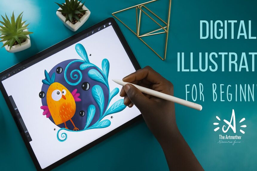
If you’ve ever doodled in a notebook and thought, “I wish I could make this look digital,” you’re in the right place. Digital illustration doesn’t require expensive setup or superhero-level art skills—just curiosity, a little patience, and the right starter tools. In this guide, we’ll walk through the essentials to get you from rough sketches to polished digital art, with practical tips you can try today. Let’s dive in and keep it fun.
- Introduction
- What is digital illustration?
- Basic tools and software
- Core concepts every beginner should know
- Your first project: a simple character
- Workflow tips for consistency and speed
- Common mistakes and how to fix them
- Getting feedback and improving
- Next steps and practice ideas
- Frequently asked questions
- Closing note
What is digital illustration?
Digital illustration is the process of creating images using digital tools—think drawing with a mouse, tablet, or stylus, but with the ability to undo, layer, and experiment freely. It combines traditional art fundamentals (shape, form, line, color, composition) with computer techniques (layers, brushes, effects). The result can be anything from sketches to fully rendered scenes, icons, or concept art. The main advantage: you can iterate quickly, make changes without starting over, and export your work in multiple formats.
Basic tools and software
Hardware
- Drawing tablet or tablet with a pen: Common entry points include entry-level drawing tablets and screen tablets (e.g., Wacom, iPad with Apple Pencil, other brands like XP-Pen, Huion). A pen that feels natural to you matters more than the brand.
- Computer or tablet: Many beginners start with a tablet, but you can also draw directly on a computer monitor with a graphics tablet.
Software (pick one to start)
- Raster-based programs (great for painting and illustration):
- Adobe Photoshop (industry standard, subscription)
- Procreate (iPad; intuitive, powerful, affordable)
- Clip Studio Paint (great for comics and illustration; perpetual license option)
- Krita (free, open-source)
- Vector-based programs (great for clean lines, scalable art):
- Adobe Illustrator (industry standard, subscription)
- Affinity Designer (one-time purchase, strong value)
- All-in-one or beginner-friendly options:
- Procreate (iPad) remains a favorite for beginners due to its simplicity and tap-friendly gestures.
- Krita or Krita + a tablet for free learning.
Tips
- Start with one program you’re comfortable with and explore its basic brushes, layers, and selection tools.
- Save your projects in a layered native format (e.g., .PSD for Photoshop, .KRA for Krita) so you can come back to edit later.
Core concepts every beginner should know
- Layers: Think of layers as transparent sheets. Draw on different sheets to keep elements separate (sketch, line art, color, shading). This makes edits easier.
- Brushes and textures: Brushes simulate different painting tools (pencils, pens, watercolor, airbrush). Start with a basic set: pencil, ink pen, soft brush, and a flat color fill.
- Line quality: Vary line weight to convey weight, depth, and energy. Gentle pressure changes create thinner lines; heavier pressure creates bolder lines.
- Color fundamentals: Learn about hue, value (lightness/darkness), and saturation (intensity). Simple color schemes (analogous, complementary) help your work feel cohesive.
- Shape language: Use simple shapes to block out forms before adding details. This helps with proportions and rhythm in your composition.
- Proportions and anatomy basics: You don’t need perfect anatomy at the start, but understanding the basics (head proportions, limb lengths) helps create believable characters.
- Composition: Consider focal points, rule of thirds, balance, and negative space. A strong thumbnail layout saves you from bigger problems later.
- Lighting and shading: Determine a light source and apply highlights and shadows accordingly to give a three-dimensional feel.
- Non-destructive editing: Use layers, masks, and adjustment layers to adjust color and value without permanently changing your original drawing.
Your first project: a simple character
Goal: Create a cute, simple character using basic shapes and color.
Steps:
- Sketch: On a new layer, draft a rough pose using circles and rectangles to block head, torso, limbs.
- Line art: Create a new layer above the sketch. Use a clean, confident line for the final outline. Vary line weight slightly.
- Color blocks: Add a new layer under the line art. Fill the main colors (skin, clothing, hair) with flat colors.
- Shading: Add another layer for shadows (use a color slightly darker than the base). Consider a light source from the top-left for consistency.
- Highlights: Add a small highlight layer where light hits (edges of hair, cheeks).
- Final tweaks: Adjust the background color or simple gradient to make the character pop, and export as PNG.
Tips:
- Keep the initial shapes simple; you can refine details later.
- Use symmetry tools or mirror painting if your software supports it for character halves.
Workflow tips for consistency and speed
- Create a simple project template: A canvas size, a few layers named (Sketch, Lineart, Color, Shadow, Highlight, Background). Save it as a template.
- Use tight vs. loose sketches: Start with a loose sketch to explore pose, then a tighter sketch to lock proportions.
- Short practice sessions: 20–30 minute daily sessions beat longer infrequent bursts. Consistency builds skill.
- Shortcuts: Learn a few essential shortcuts in your software (undo, redo, brush size, color picker, layer grouping) to speed up your workflow.
- Color management: Create a small color palette you stick to for a project. This keeps your art cohesive and reduces indecision.
Common mistakes and how to fix them
- Over- or under-inking: If lines feel stiff, loosen your wrist and vary line weight; don’t force a single uniform line.
- Flat color without depth: Add soft shadows and a subtle highlight to give volume. Build up layers rather than making one flat color.
- Bad proportions: Use basic shapes to block out forms first; compare to references; adjust in the sketch stage.
- Clipping/misaligned layers: Name and group layers logically; use clipping masks to keep shading within boundaries.
- Rushing details: Focus on a few key features first (eyes, silhouette, hands). Details come later.
Getting feedback and improving
- Share progress-in-progress (work-in-progress) posts with captions about your process to invite feedback.
- Seek specific feedback: ask about proportions, line quality, or color harmony rather than vague “looks good.”
- Use references: Study art you admire and try to replicate small sections to learn techniques, then apply to your own style.
- Create a critique checklist: Proportions, anatomy, brushwork, color harmony, lighting, composition. Use it to evaluate each piece.
- Iterate: Revisit older pieces after a few weeks with newly learned techniques for a fresh take or improved approach.
Next steps and practice ideas
- Practice prompts:
- A cozy character in a room with a single light source
- A simple animal silhouette with a playful expression
- An everyday object with reflective lighting
- A stylized landscape with a bold color palette
- Study and imitate: Recreate a small panel from a favorite illustration to learn composition and brushwork (don’t copy, but learn).
- Build a mini portfolio: Save your best five to ten pieces in an organized folder. Add titles, dates, and a short description of what you learned.
- Learn from tutorials: Look for beginner-friendly tutorials that walk you through layers, brushes, and color work in your chosen software.
- Experiment with brushes: Try different brush dynamics (spacing, opacity, flow) to see how each changes your strokes.
Frequently asked questions
- Do I need to learn both raster and vector, or can I stick with one? You can start with raster for painting and illustration and explore vector later if you want scalable line art. Many beginners stay with raster in the early stages.
- How long does it take to get proficient? It varies, but with consistent practice (20–30 minutes a day) you’ll notice steady progress in a few months.
- Is a drawing tablet essential? Not strictly, but a tablet with a pen makes drawing much more natural and precise than a mouse. Start with affordable options and upgrade as you grow.
- Should I learn anatomy? Basic anatomy helps, especially for characters. You don’t need to be perfect, but understanding proportions will reduce frustration.
- How do I choose a software? Pick one that matches your budget and goals. Procreate is great for beginners on iPad; Krita or Clip Studio Paint are solid for desktop; Illustrator or Affinity Designer are good for vector work.
Closing note
Digital illustration is a journey of curiosity, practice, and gradual improvement. Don’t be afraid to experiment, make mistakes, and share your work with others to get constructive feedback. Most importantly, keep it fun. Every stroke gets you closer to where you want to be.



Your writing is like a breath of fresh air in the often stale world of online content. Your unique perspective and engaging style set you apart from the crowd. Thank you for sharing your talents with us.